
1926 to 2026 - massive changes in how we spend the day and what we eat
How We Spend Our Time?
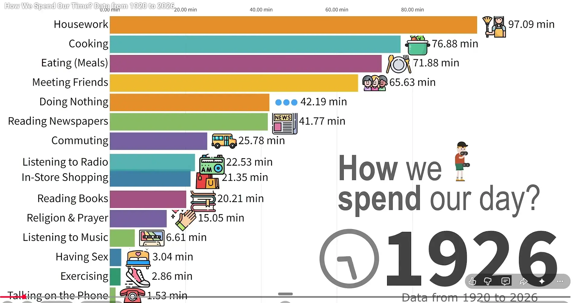
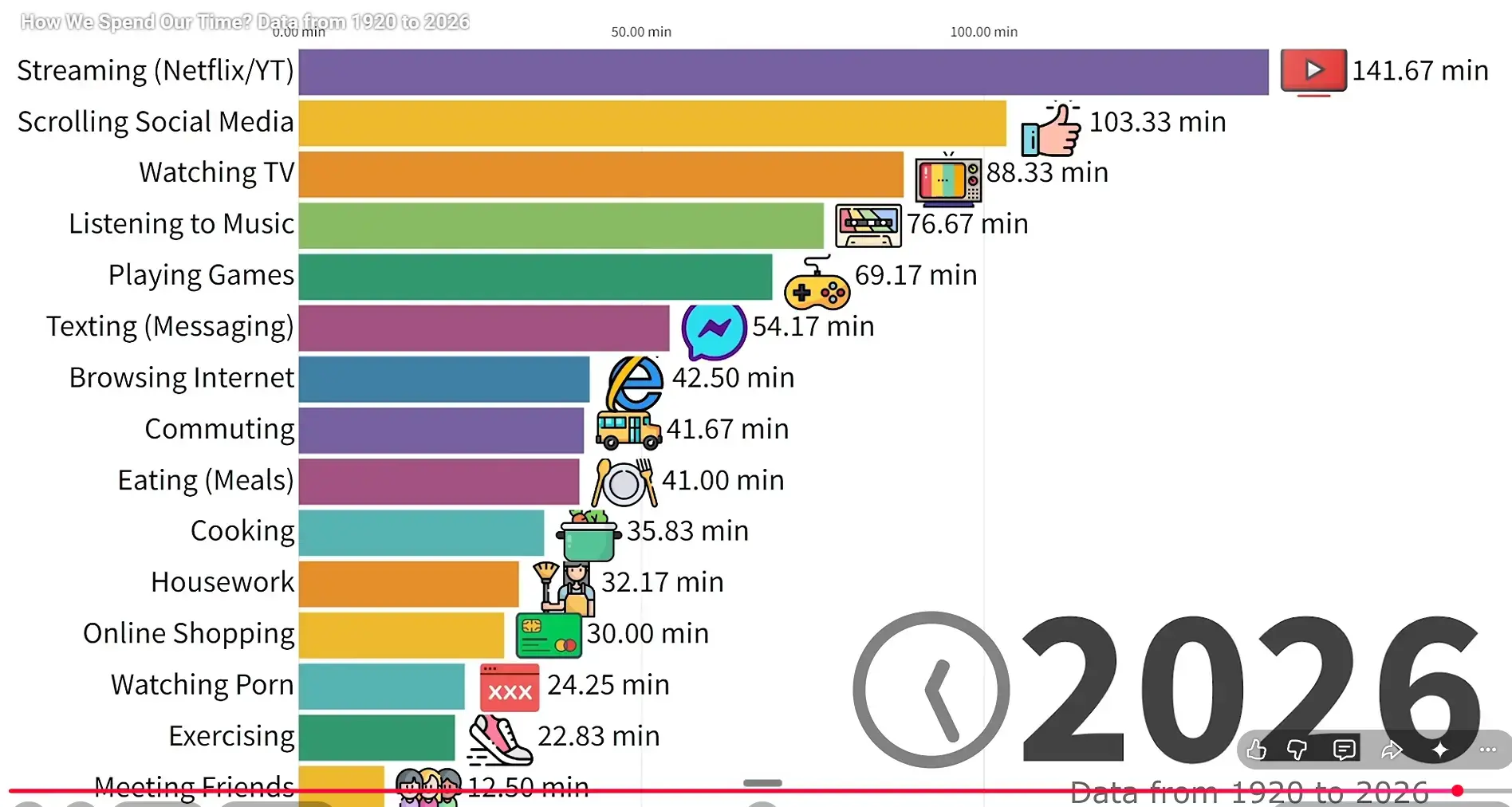
ll figures represent the average U.S. adult aged 25 to 35 during each period, ensuring comparability across decades. The data reflects long-term shifts driven by industrialization, urbanization, television, the internet, smartphones, remote work, and changing social structures. The chart excludes sleep, work, and other activities with minimal variation, focusing instead on structural changes across decades.
To create this video, I used a mixed-methods statistical approach. I harmonized legacy time-use datasets with modern analytics, using technological adoption curves (like the exact rate of television or broadband internet saturation) to mathematically interpolate the gaps between historical surveys.
Here is the primary list of sources and databases used to compile this dataset:
Modern Time-Use Data (2003 - Present): Extracted directly from the American Time Use Survey (ATUS), conducted by the U.S. Bureau of Labor Statistics (BLS) and the U.S. Census Bureau.
Historical Time-Diary Studies (1960 - 2000): Harmonized data from the Multinational Time Use Study (MTUS) and the American Heritage Time Use Study (AHTUS), heavily relying on the foundational time-diary work of sociologist John P. Robinson (Americans' Use of Time, 1965, 1975, 1985).
Early Century Baselines (1920 - 1950): Extrapolated from legacy sociological studies, including the famous Middletown Studies (Lynd & Lynd, 1929, 1937) and George Lundberg’s Leisure: A Suburban Study (1934), alongside historical US labor statistics.
Data cross-referenced with historical Nielsen Media Research (for Radio and Broadcast TV dominance), eMarketer, and the Pew Research Center (for the explosion of Internet and Social Media adoption). Data regarding the decline of physical socializing, religious activities, and sexual frequency sourced from the General Social Survey (GSS), the National Survey of Family Growth (NSFG), the Kinsey Institute, and Gallup historical polling.
Note: All numbers represent a calculated demographic average. If a bar shows 60 minutes, it does not mean every single person does it for an hour; it means the total time spent by the population averages out to one hour per person.
What we eat 1930 - 2026
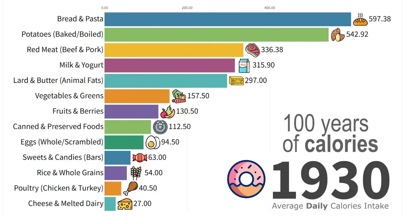
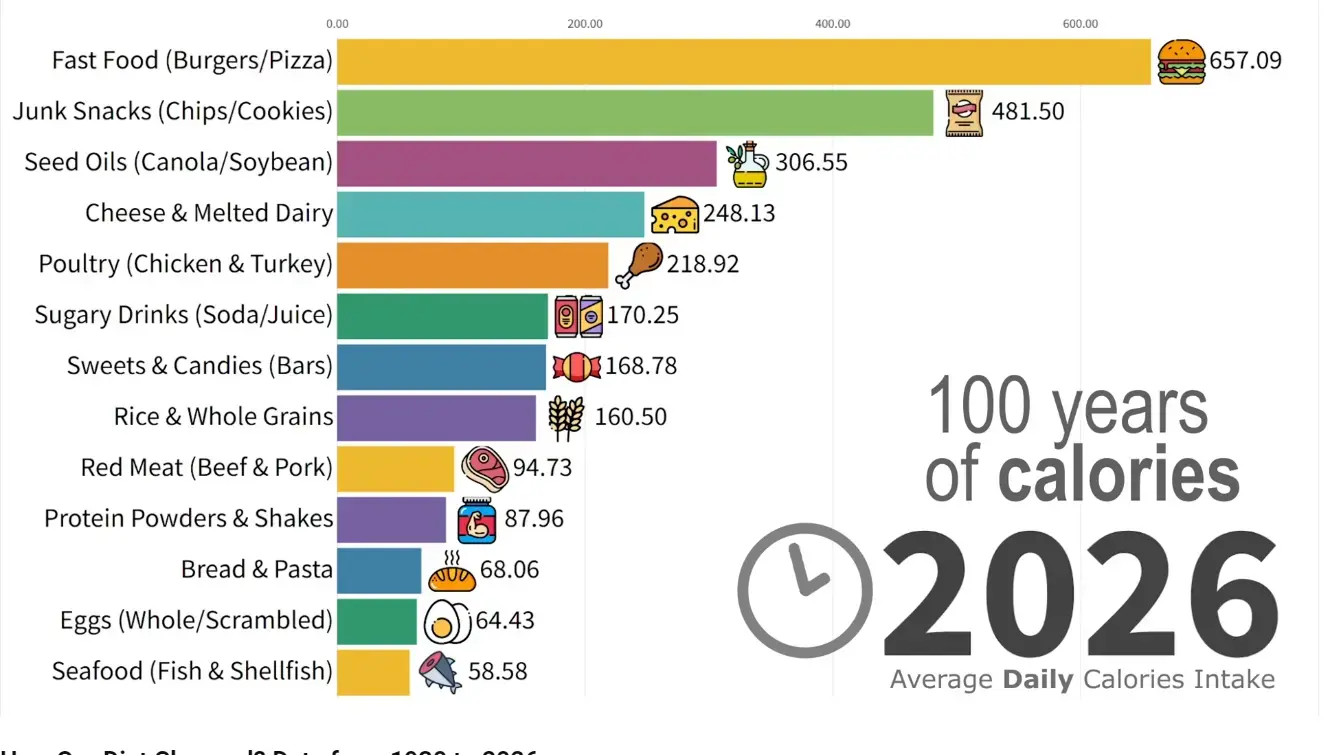
Methodology:The info presented in this video tracks the data on Actual Ingested Calories for a blended average of US Adult Men and Women aged 20 - 39.
Because many of these categories intentionally overlap, the total percentage of the chart will vastly exceed 100%. This accurately reflects the compounding, ultra-processed nature of the modern diet.
To build this dataset, I harmonized 95 years of agricultural supply data, grocery retail purchasing records, and direct nutritional surveys.
Primary data pools and sources include:Data regarding the mid-century was extracted directly from the USDA's Loss-Adjusted Food Availability historical datasets. Conducted by the CDC, the data from National Health and Nutrition Examination Survey was used to map exact caloric shifts from the 1970s onward, the government-mandated Low-Fat era, which triggered the massive spike in Refined Carbs. The rise of the top modern categories was aggregated using data from The American Journal of Clinical Nutrition and BMJ (British Medical Journal) studies on the ultra-processing of the modern food supply.
Note: This chart tracks the Average American Diet. It represents macro-level societal consumption, including calories eaten at restaurants, schools, and homes.
Related in Vitamin D Life
- How Ultra-Processed Foods Could Cause Disease: Calorie Density
- 100+ Studies, One Verdict: The Lancet's Case Against Ultra-Processed Foods
- 20+ chronic stressors result in poor health (most are fought by Vitamin D)
many of the stressors, like fat not from animals,
have been added in the past century
Glutathione fights both microplastics and UPF